
25 October 2017 | 7 Minute(s) to read
"How much!? But it's just a small picture?"
Not realising the value of good communication, a lot of people think they’ll just get Jimmy from next door to draw up something for their company logo. This is one of the reasons I am writing this article, to shed some light on how much work goes into designing a logo.
An effective logo is distinctive, appropriate, practical, graphic, simple in form and conveys an intended message. All of these elements need to be considered to ensure proper brand recognition. Your logo is at the forefront of your business and needs to be done right.
There are several steps to designing a logo, a design professional will know these steps and consciously follow them. You'll also learn that once you know these rules, you can break them. Here’s the process that we try to stick to:
Brief: Interview with the client.
Research: Competitors, industry trends.
Inspiration: First the designer needs to get inspired, magazines, nature, online inspiration, these are all good ways to get inspired.
Sketching & Conceptualising: Rough sketches and weeding out bad ideas.
Reflection: Going back over concepts and evolving good ones. Present those initial ideas to the client to get buy-in and feedback.
Revisions: Taking the chosen concepts and tracing, tweaking and redrawing them to a final concept. Preset to the client once more.
Production: Taking the final concept and drawing it up, vectorising it and adding finishing touches.
Presentation: Present final product to client.
Delivery: Full style guide with all files needed.
Here are the steps I went through when designing the Cactus Juice logo:
CACTUS JUICE LOGO
1. Sketching
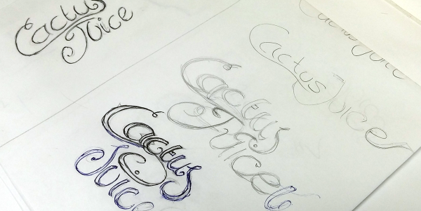
"Mocking up concepts that are completely bollocks is a natural part of good design"
Once we've sat down with the customer and are on the same page as to what is needed, we can grab a coffee, a pencil and head over to the paper.
There are no rules in this phase, you have full creative licence to approach this however you see fit, just get some ideas out of your head onto paper.
The sketching phase is all about weeding out the useless concepts, if you find yourself sketching out ideas that are complete rubbish, then you're on the right track. Mocking up concepts that are complete bollocks is a natural part of good design.
As you progress with this stage you will notice with each sketch you'll feel better and better about them.
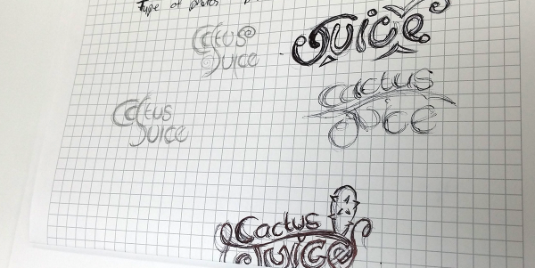
You can take your favourites from the sketches, trace them onto a new piece of paper, then evolve that concept into other concepts. This helps you to visually weed out the bad ideas, and evolve the good ones.
It's also important to keep going within these sketches and bring them as close to the final product as possible, as this will save you time in later stages.
Take the time to focus on the little things. Detail will make or break a logo, so focus on getting all this right now. Play with flourishes, line weight, angles and shapes, even turn the concepts upside down. If a logo feels visually awkward when upside down, it's an indication that something is unbalanced.
2. Vectorizing
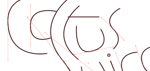
We need to get this sketch into illustrator. I use my phone and transfer it that way or you can use a scanner if you have a good one. Depending on the weight of your lines you might need to put it in Photoshop first to up the contrast.
Set the opacity to something like 20% and lock the layer. Then you need to begin the long process of drawing up the whole logo with the pen tool, paying careful attention to each of the curves, line weights and points. Start with outlining each of the letters. Depending on the complexity of the logo, this could take a while, take your time, as this needs to be done correctly.
Once you have the outline you can fill it in. Unless you’re just using the solid stroke like me in this example, when you do this you should immediately identify any areas that need work. Usually, the thickness can be tweaked by increasing the stroke size.
Keep going over the design and tweaking it until it feels comfortable to look at. There shouldn't be any awkward points and it should be balanced as a whole. Flip it on its head to see if it still looks snazzy upside down, if it does, we're on our way.
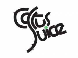
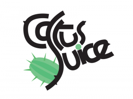
The above concept is pretty close, except we are left with this awkward space at the bottom left, so I decided to use this area for some colour and imagery. I felt imagery was needed and it will help people to visually recognise what the first word says. This final touch makes the design balanced, and much more aesthetically pleasing. You can also see I've added some subtle spikes for further reinforcement of the product.
3. Sleep on it
"Yes, literally sleep on it, well, not on the logo, you get the point..."
Tunnel vision is very natural. Look at one thing too long and it becomes harder to see the bigger picture, so at this point I tend to go sleep on it, work on something else, have a lunch break or all of the above. You'll find the second you come back you will notice something you didn't before.
A good example of this is I realised after a break that everything was too claustrophobic, so I added a thin white stroke to the middle of the text and boom, now we have a logo.

4. Photoshop
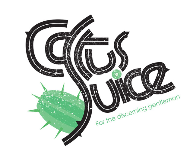
We have the vector version of the design complete, now we want to add some texture to it. It's a very organic natural style so it's going to need this texture to liven it up.
We want to import it into photoshop and experiment with some textures. I played around with several blending modes, textures etc.
5. Final Product
After the photoshop phase, we should have a fully functional logo design:
 6. Application testing
Once we have the final product, I like to test the logo on the media it will appear. I've included a few examples below:
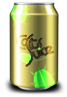
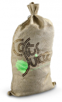
This lets us see the design in real-world applications, you can also identify potential issues and see if the logo actually works in the client's eyes.
As you can see, it’s a long process but the end result is a clearly defined, eye-catching logo that works across a variety of applications - that’s why it should be done by a professional.


